Year:2022
Python
Remote sensing
at National Taiwan University
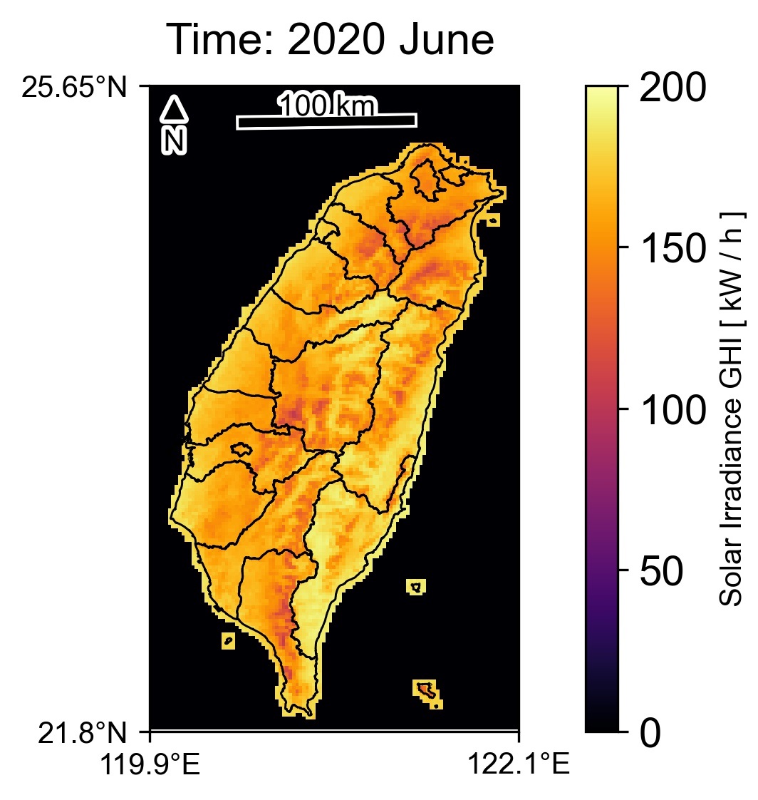
Taiwan GHI map
at National Taiwan University
Year:2022
Python
Remote sensing
Description
Map past global horizontal irradiance (GHI) to support the renewable solar energy sector in Taiwan.
First, I downloaded Himawari-8 satellite data and NASA's MERRA-2 reanalysis data.
Second, I applied the methodology proposed in the manuscript, which is a modified Heliosat method. The processing was performed using Python scripts.
Lastly, the output data, originally at hourly temporal resolution, were aggregated to monthly sums.
These data will later be used to produce a typical meteorological year for the entire island of Taiwan.

import numpy as np
import pandas as pd
import glob
import os
import xarray as xr
import matplotlib.pyplot as plt
import cartopy.crs as ccrs
import cartopy.feature as cfeat
from cartopy.io.shapereader import Reader
from cartopy.mpl.ticker import LongitudeFormatter, LatitudeFormatter
from PIL import Image

#Readshapefile with counties and Taipei town
reader = Reader(os.path.join(f"{path_to_county_shp}/COUNTY_MOI_1090820.shp"))
county = cfeat.ShapelyFeature(reader.geometries(), ccrs.PlateCarree(),
                              edgecolor="black", facecolor="none")

reader2 = Reader(os.path.join(f"{path_to_Taipei_shp}/TPEtown.shp"))
Taipeitown = cfeat.ShapelyFeature(reader2.geometries(), ccrs.PlateCarree(),
                                  edgecolor="white", facecolor="none")

#Monthly sum file in netcdf
montsum = xr.open_dataset(f"{path_to_netcdf}/01SSI_monhtsum_2020.nc")

#Taiwan plus Taipei view monhtly
for i in range(0,12):
    #convert W to kW
    ds = montsum.data[i]/1000

    #Figure
    fig = plt.figure(dpi=300)
    #set Arial font
    plt.rcParams["font.family"] = "Arial"
    #lon/lat formater
    lon_formatter = LongitudeFormatter(zero_direction_label=True)
    lat_formatter = LatitudeFormatter()

    #set projections for ax1 - Taiwan
    ax1 = plt.subplot(1,2,1, projection=ccrs.PlateCarree())
    ax1.set_extent([119.9, 122.1, 21.8, 25.65], ccrs.PlateCarree())
    #set corner ticks
    ax1.set_xticks([119.9, 122.1], crs=ccrs.PlateCarree())
    ax1.set_yticks([21.8, 25.65], crs=ccrs.PlateCarree())
    ax1.xaxis.set_major_formatter(lon_formatter)
    ax1.yaxis.set_major_formatter(lat_formatter)
    #Plot from dataset to ax1
    pltmap = ds.plot.pcolormesh("lon", "lat", ax=ax1, cmap="inferno",
                                vmin=0, vmax=200, add_colorbar=False,
                                add_labels=False)
    #add county shapefile to view
    ax1.add_feature(county, linewidth=0.7)
    #empty title for ax1
    #ax1.set_title(" ", loc="left", fontsize=15)

    #Scale bar:From https://stackoverflow.com/a/41600150
    scale_bar(ax1, ccrs.PlateCarree(), 100, location=(0.5, 0.94))

    #set projections for ax2 - Taipei zoom
    ax2 = plt.subplot(1, 2, 2, projection=ccrs.PlateCarree())
    ax2.set_extent([121.45, 121.7, 24.95, 25.25], ccrs.PlateCarree())
    #set corner ticks
    ax2.set_xticks([121.45, 121.7], crs=ccrs.PlateCarree())
    ax2.set_yticks([24.95, 25.25], crs=ccrs.PlateCarree())
    ax2.xaxis.set_major_formatter(lon_formatter)
    ax2.yaxis.set_major_formatter(lat_formatter)
    #Plot from dataset to ax2
    pltmap = ds.plot.pcolormesh("lon", "lat", ax=ax2, cmap="inferno",
                                vmin=0, vmax=200,
                                add_colorbar=False, add_labels=False)
    #add Taipei shapefile to view
    ax2.add_feature(county, linewidth=0.7)
    ax2.add_feature(Taipeitown, linewidth=0.5)

    #Scale bar: From https://stackoverflow.com/a/41600150
    scale_bar(ax2, ccrs.PlateCarree(), 10, location=(0.5, 0.94))


    ts = pd.to_datetime(str(montsum.time[i].values))
    d = ts.strftime("%Y %B")
    plt.text(-0.5, 1.05, f"Time: {d}",
             horizontalalignment="left",
             fontsize=15,
             transform = ax2.transAxes)

    #adjust subplots to specific space between
    fig.subplots_adjust(right=1.05)

    #Colorbar
    cbar_ax = fig.add_axes([ax2.get_position().x1+0.02,
                            ax2.get_position().y0, 0.025,
                            ax2.get_position().height])
    cbar = fig.colorbar(pltmap, cax=cbar_ax)
    cbar.set_label("Solar Irradiance GHI [ kW / h ]", fontdict={"fontsize": 10},)
    cbar.ax.tick_params(labelsize=14)
    fig.subplots_adjust(wspace=0, hspace=0)


    plt.savefig(f"{path_to_save}/Solar irradiance_{i+1:03d}.JPEG", bbox_inches="tight", dpi=300)
    plt.grid()
    plt.show()
    plt.close()

# filepaths
fp_in = f"{path_to_save}/*.JPEG"
fp_out = f"{path_to_save}//video_gif.gif"

# https://pillow.readthedocs.io/en/stable/handbook/image-file-formats.html#gif
#convert('RGBA') reduces the noise in GIF format
img, *imgs = [Image.open(f).convert('RGBA') for f in sorted(glob.glob(fp_in))]
img.save(fp=fp_out, format="GIF", append_images=imgs,
         save_all=True, duration=500, loop=0)